Schneider Glam

IMG_20150213_182128_036


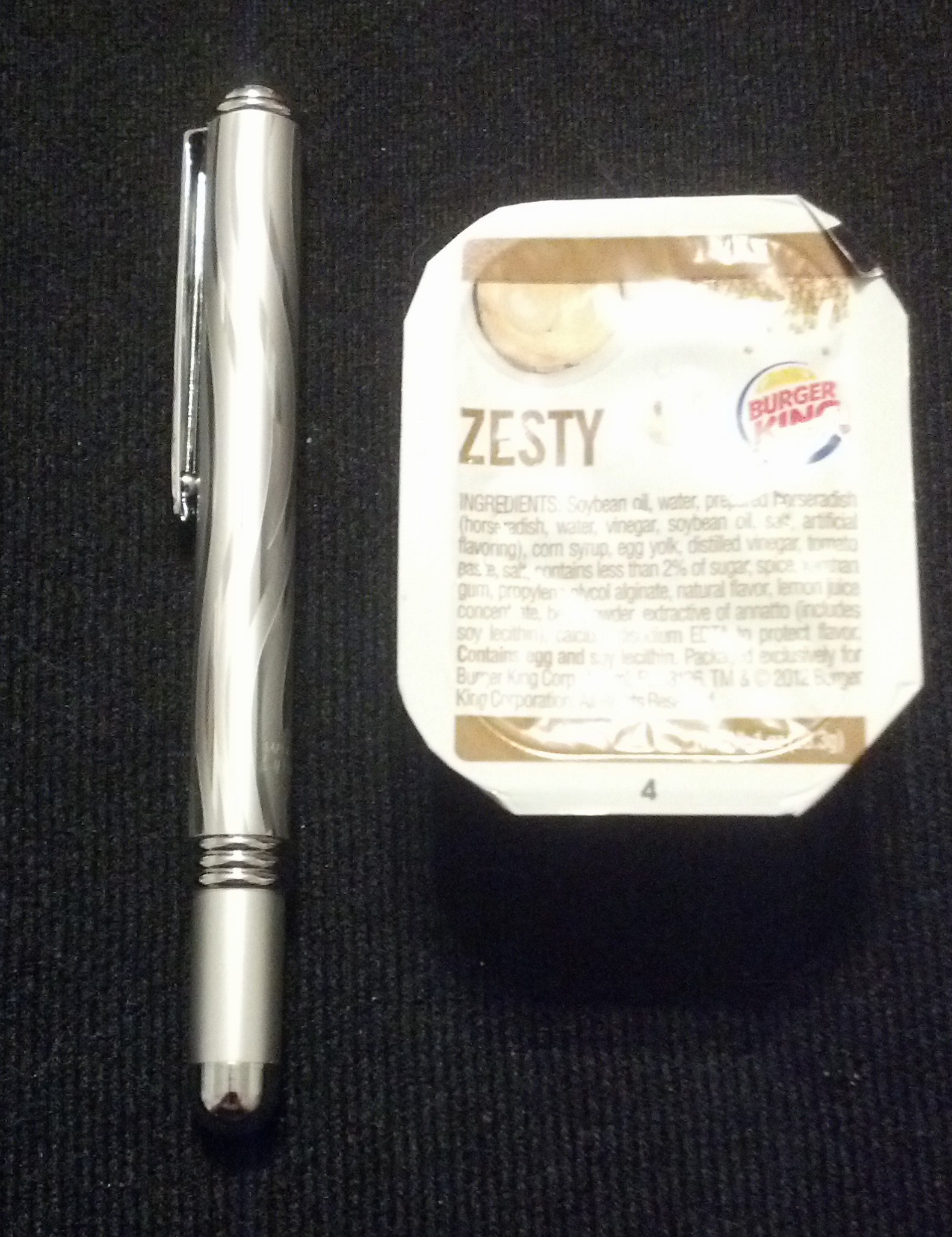
I bought this pen because it was weird. The pattern is straight up gaudy and basically has puffy paint for the silver bits. It wasn’t particularly expensive and it claimed to come with a companion eraser pen and corrector. Barkaboo? So, I bought it cause that sounded weird. Then… I never took it out of the package because well, it looks like Lisa Frank threw up on it.

IMG_20150213_182136_572


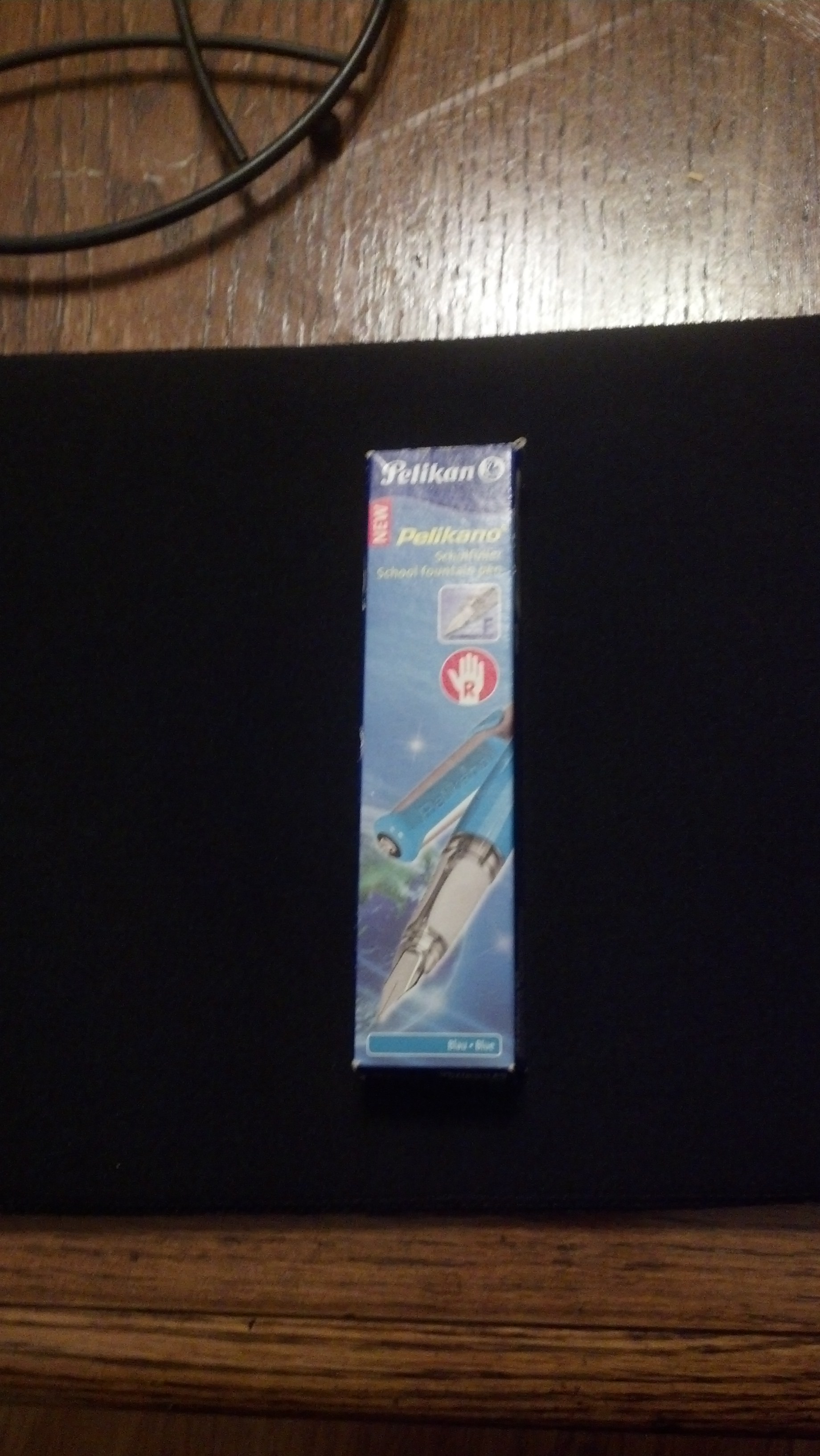
I thought maybe there would be more information inside the packaging, but this is just a card. No help there.

IMG_20150213_182307_573


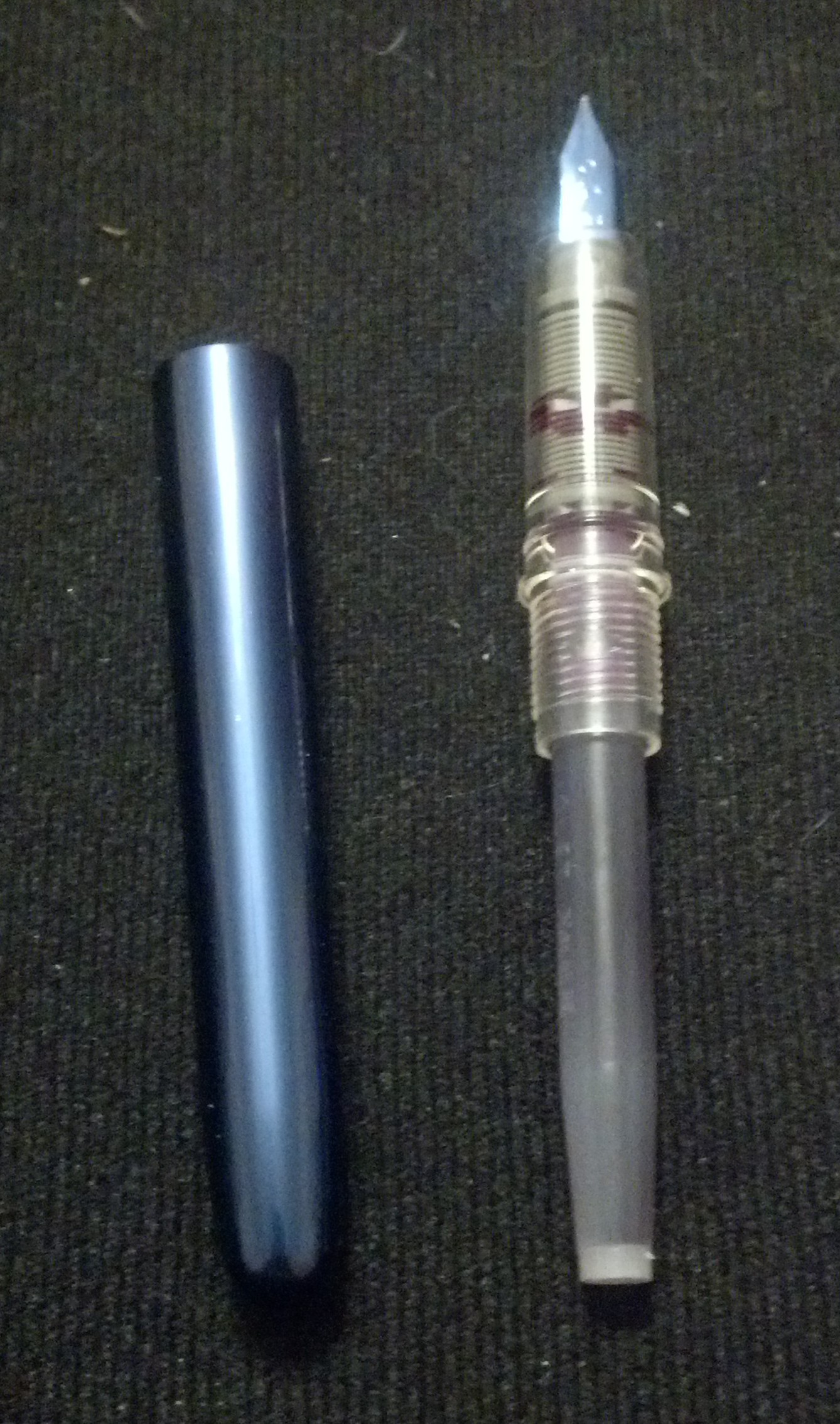
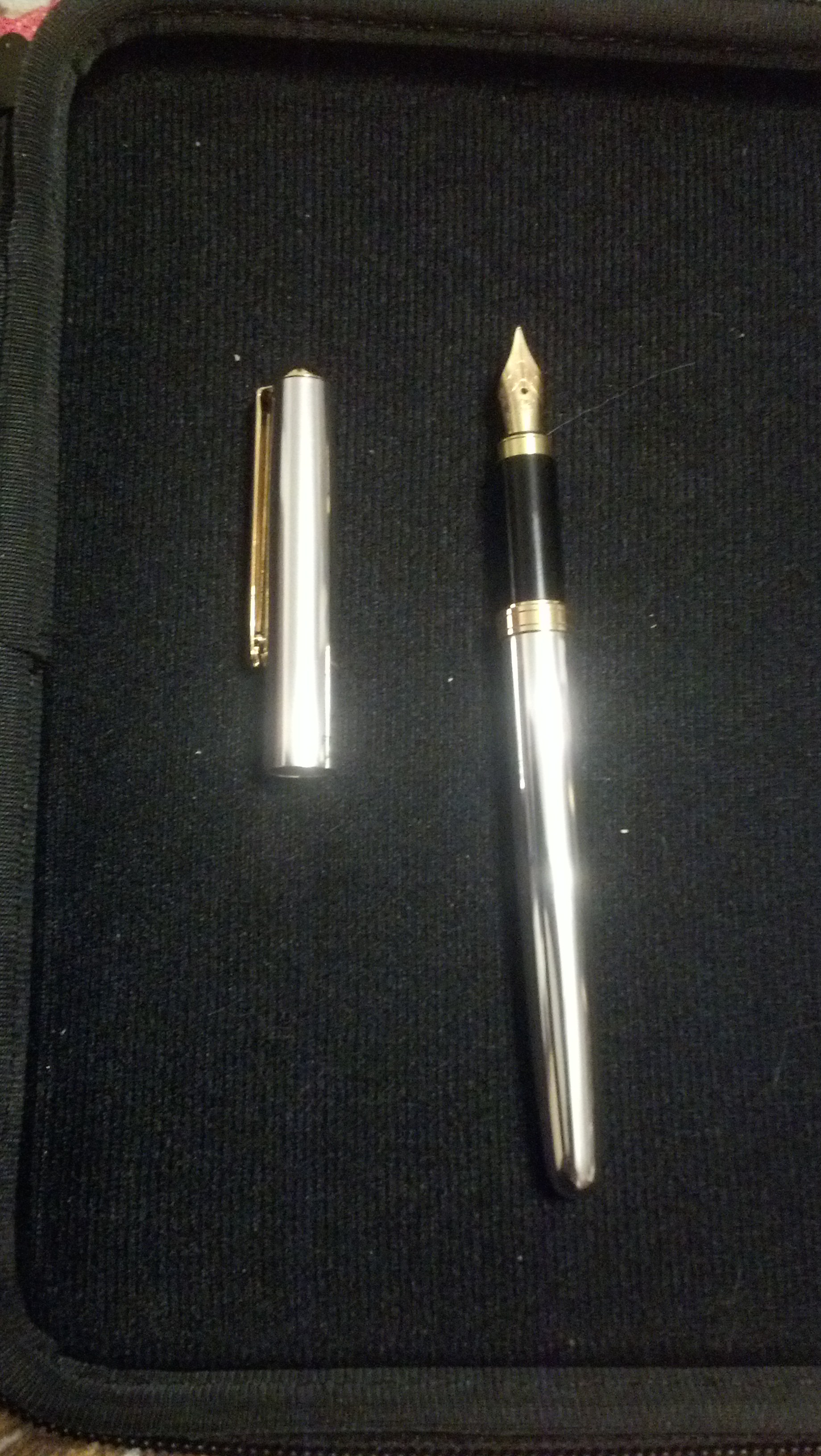
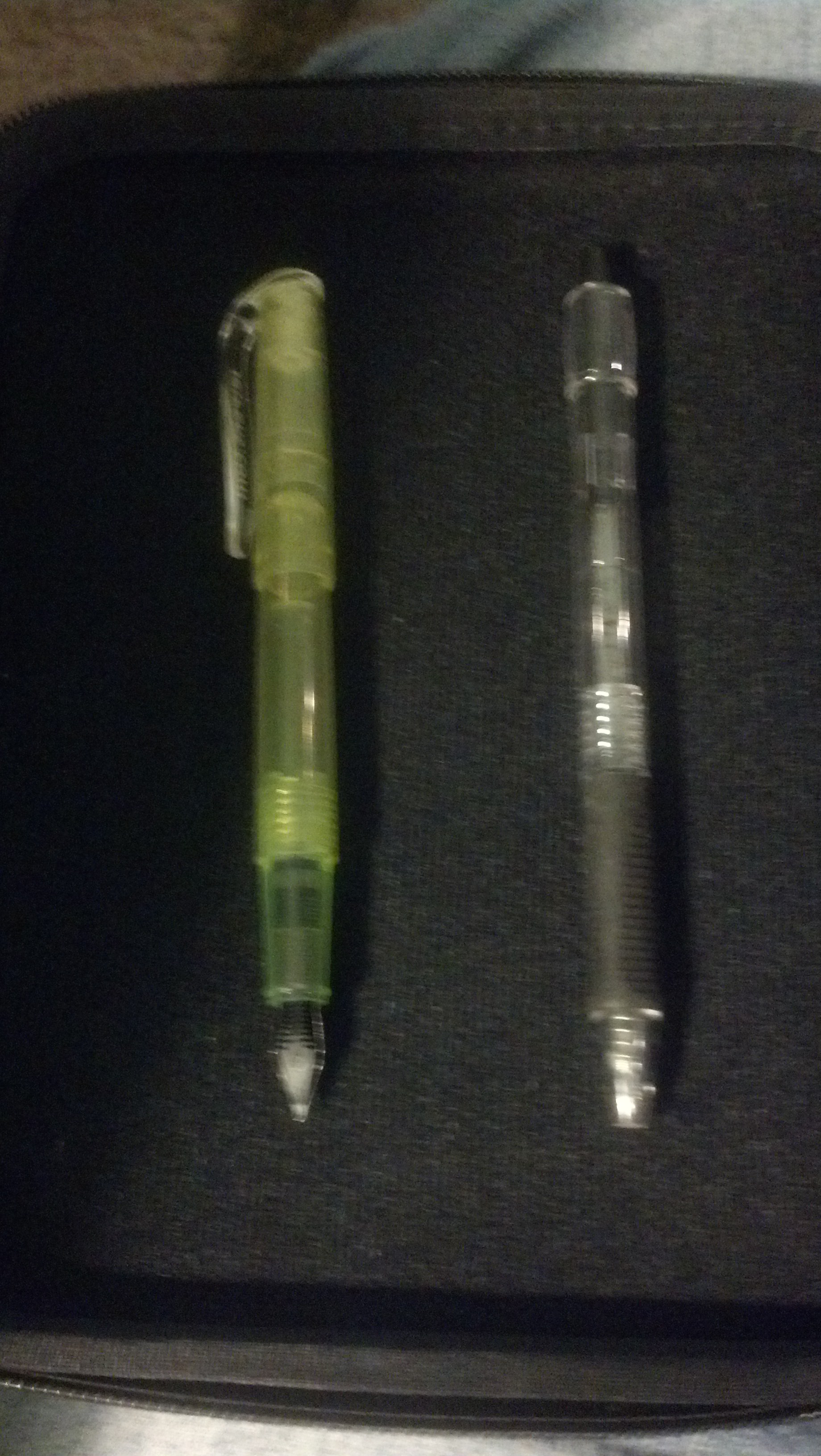
So this is what it comes with. The fountain pen, the corrector pen, and a box of cartridges. Normally I set aside any included blue or black ink and put something more colorful in to test pens, but I figured this has a particular ink formulation.

IMG_20150213_182419_359

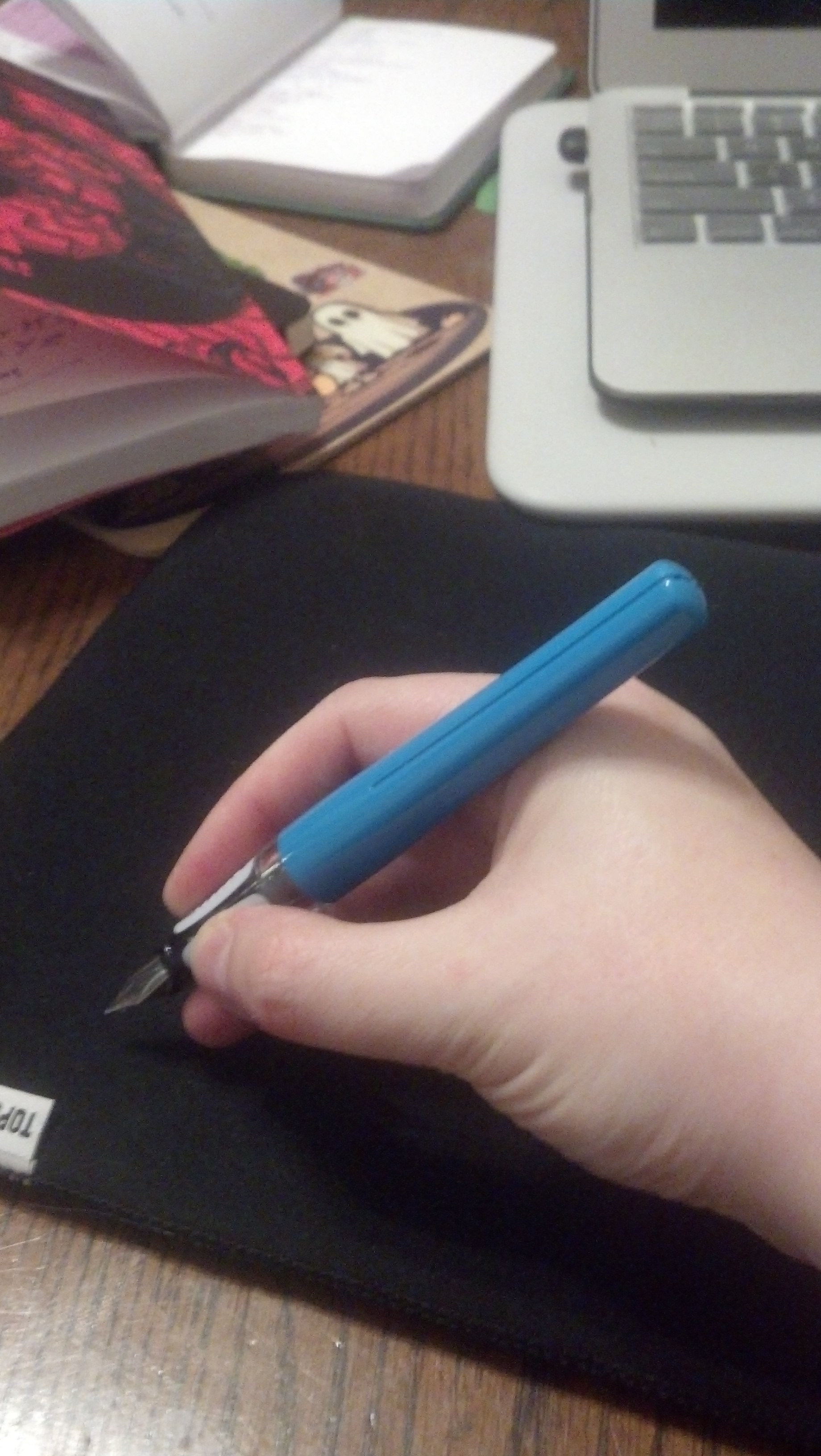
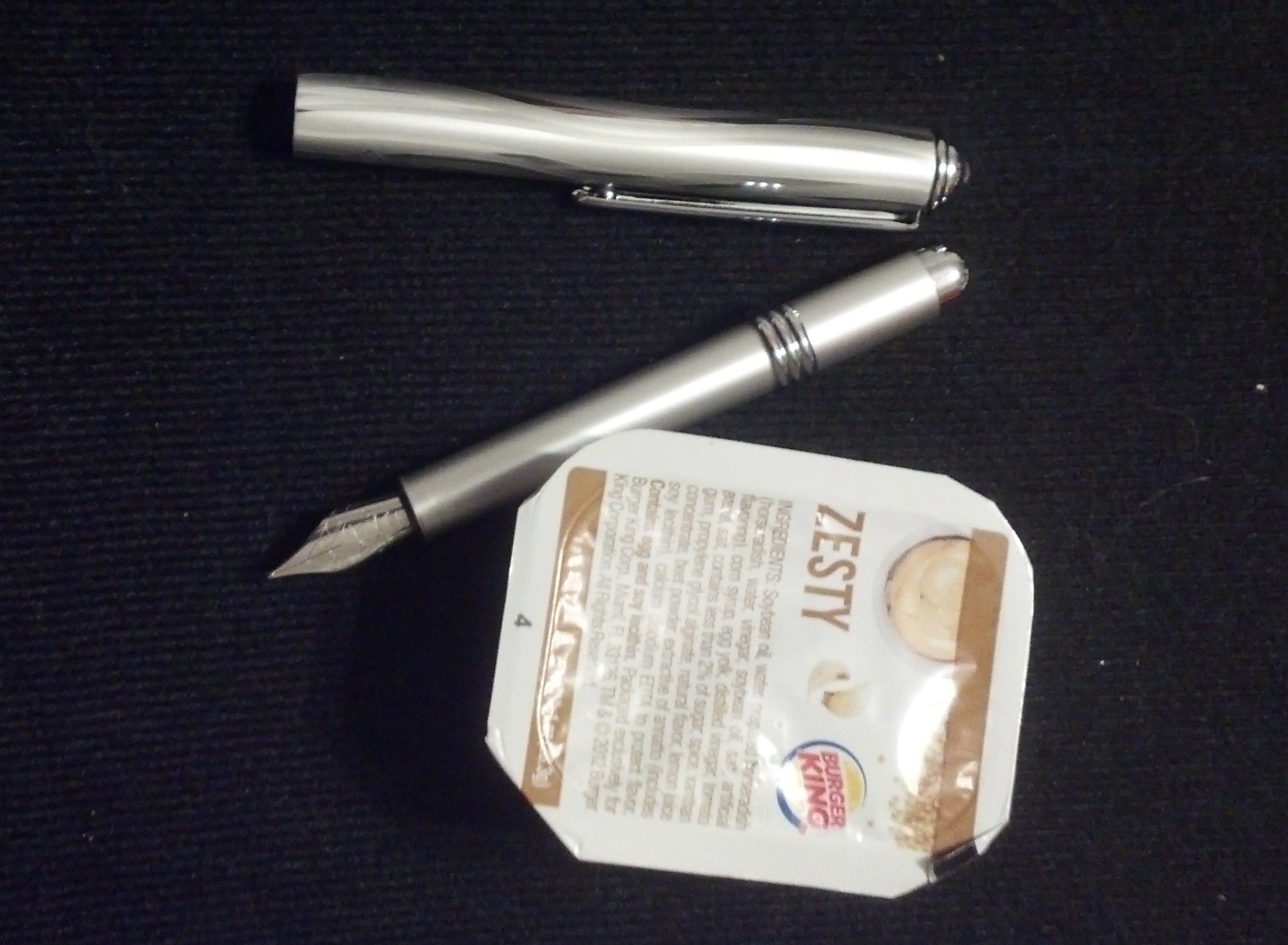
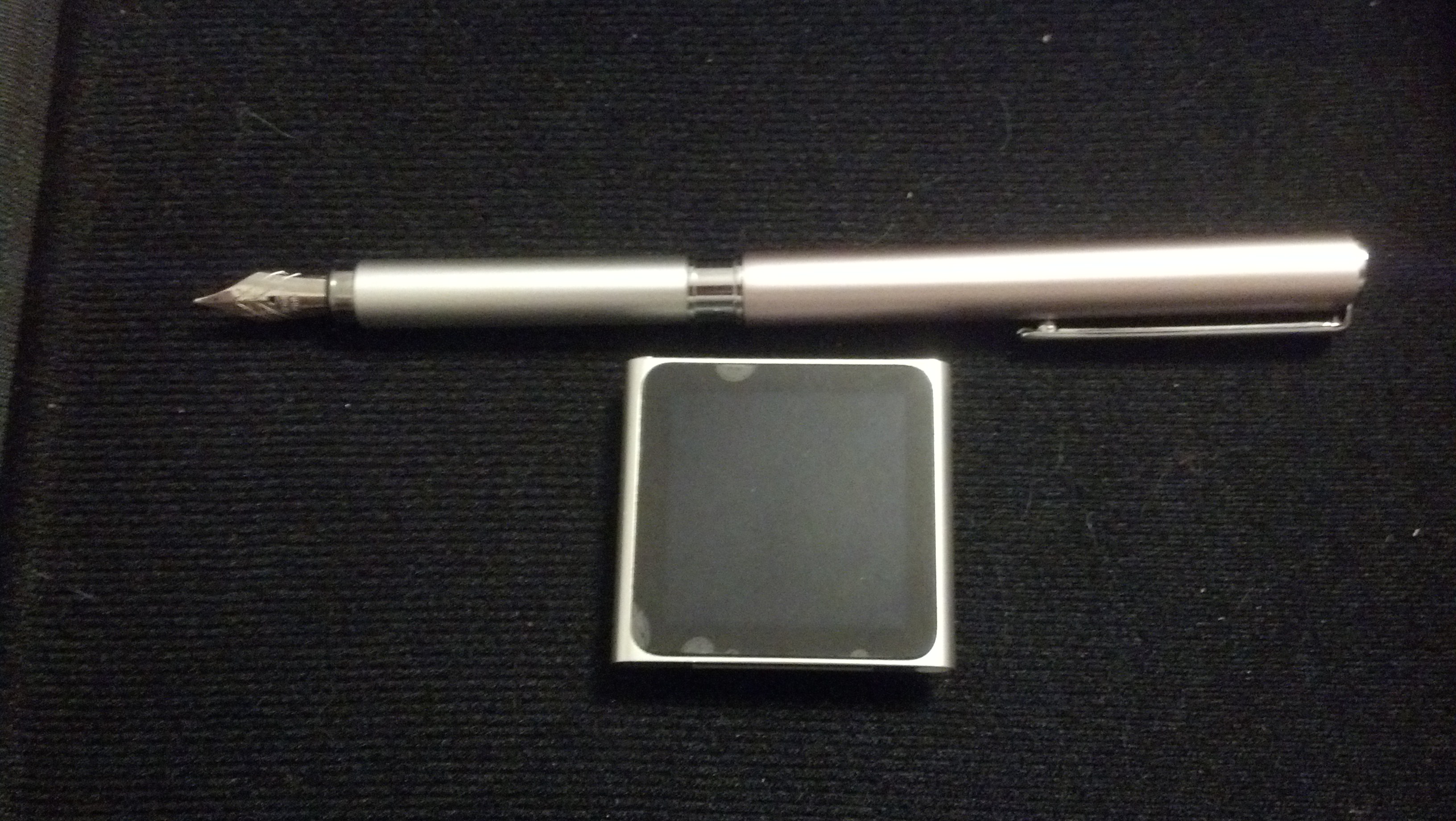
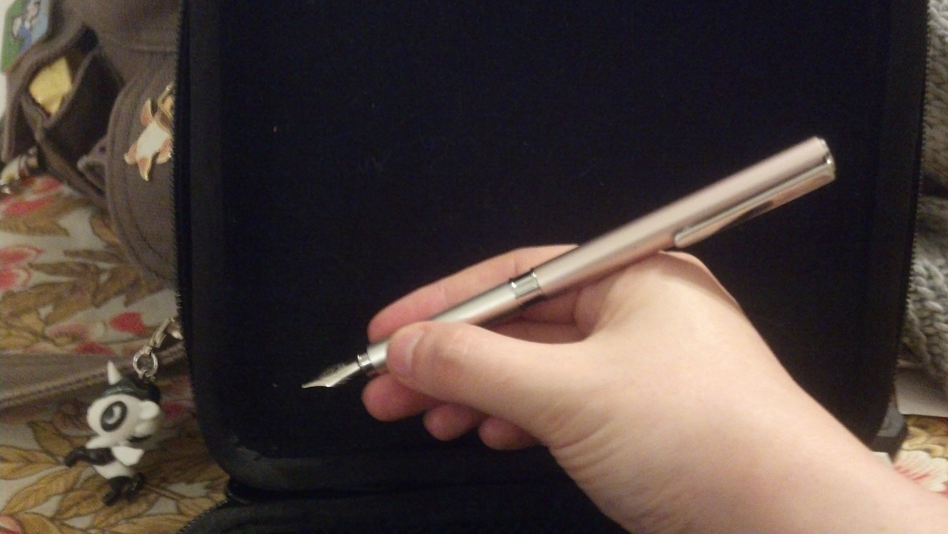
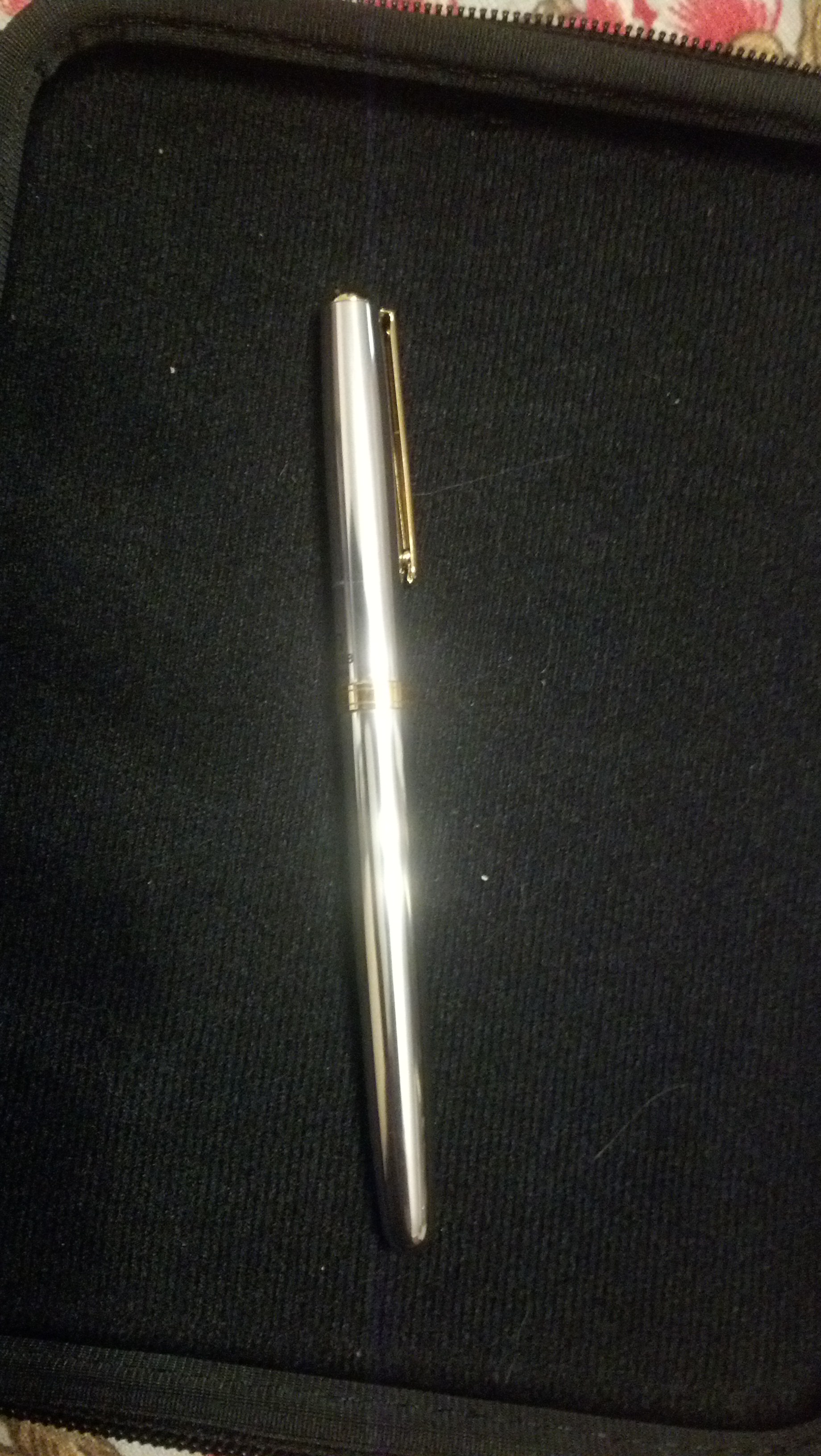
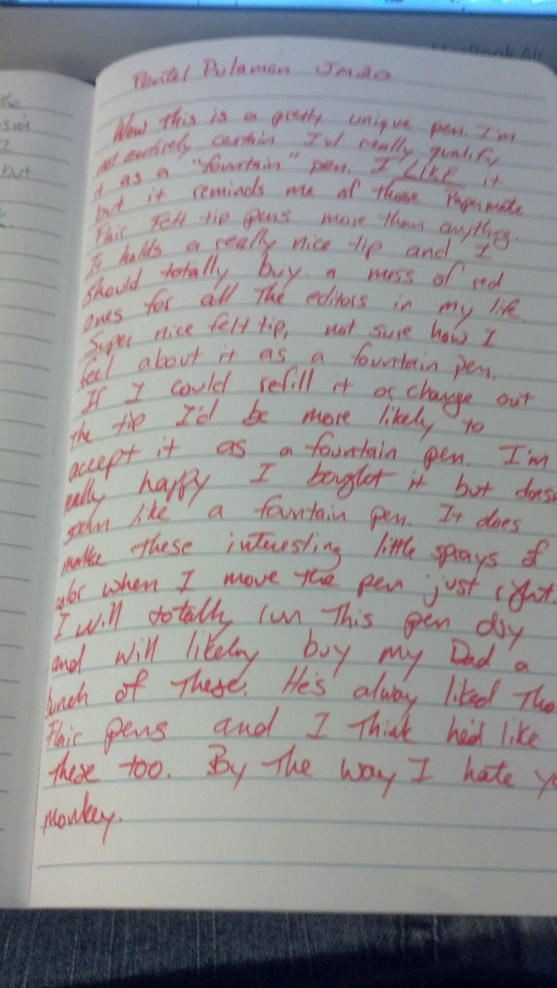
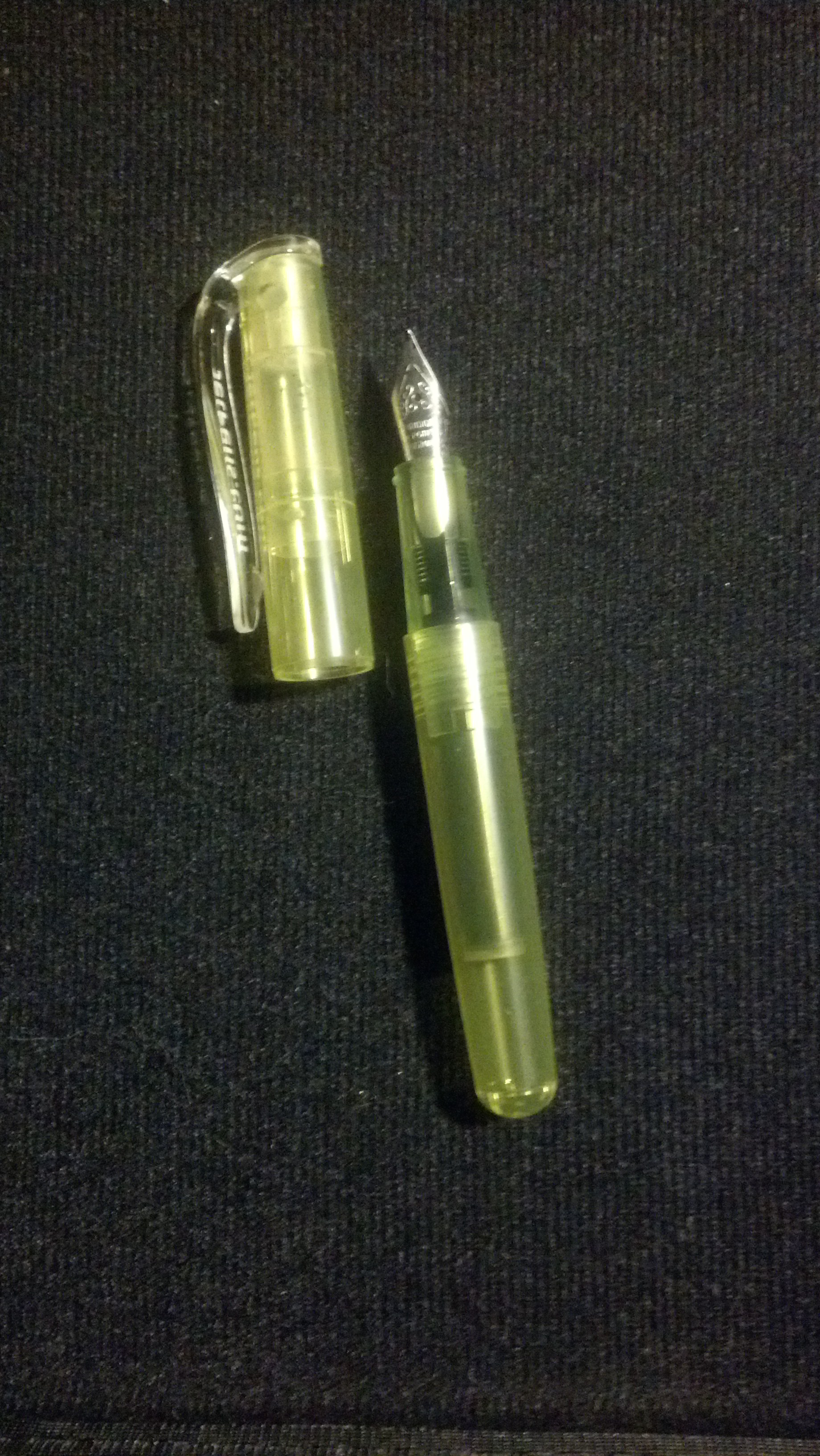
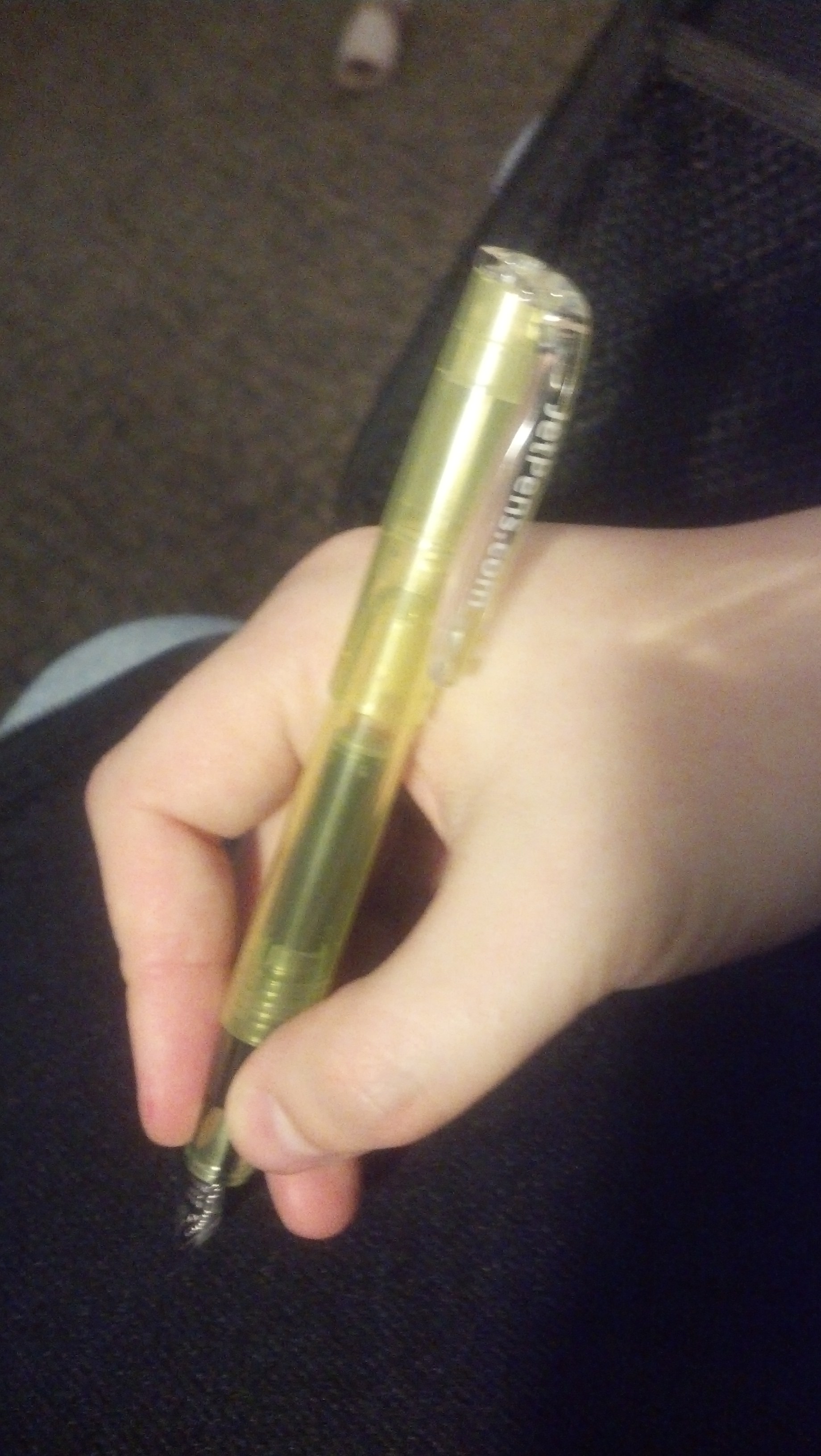
This pen has really weird angled tips on the top and bottom of the pen. The nib is normal, but it feels almost like they should have some particular function… as far as I can tell they don’t.

IMG_20150213_182453_936

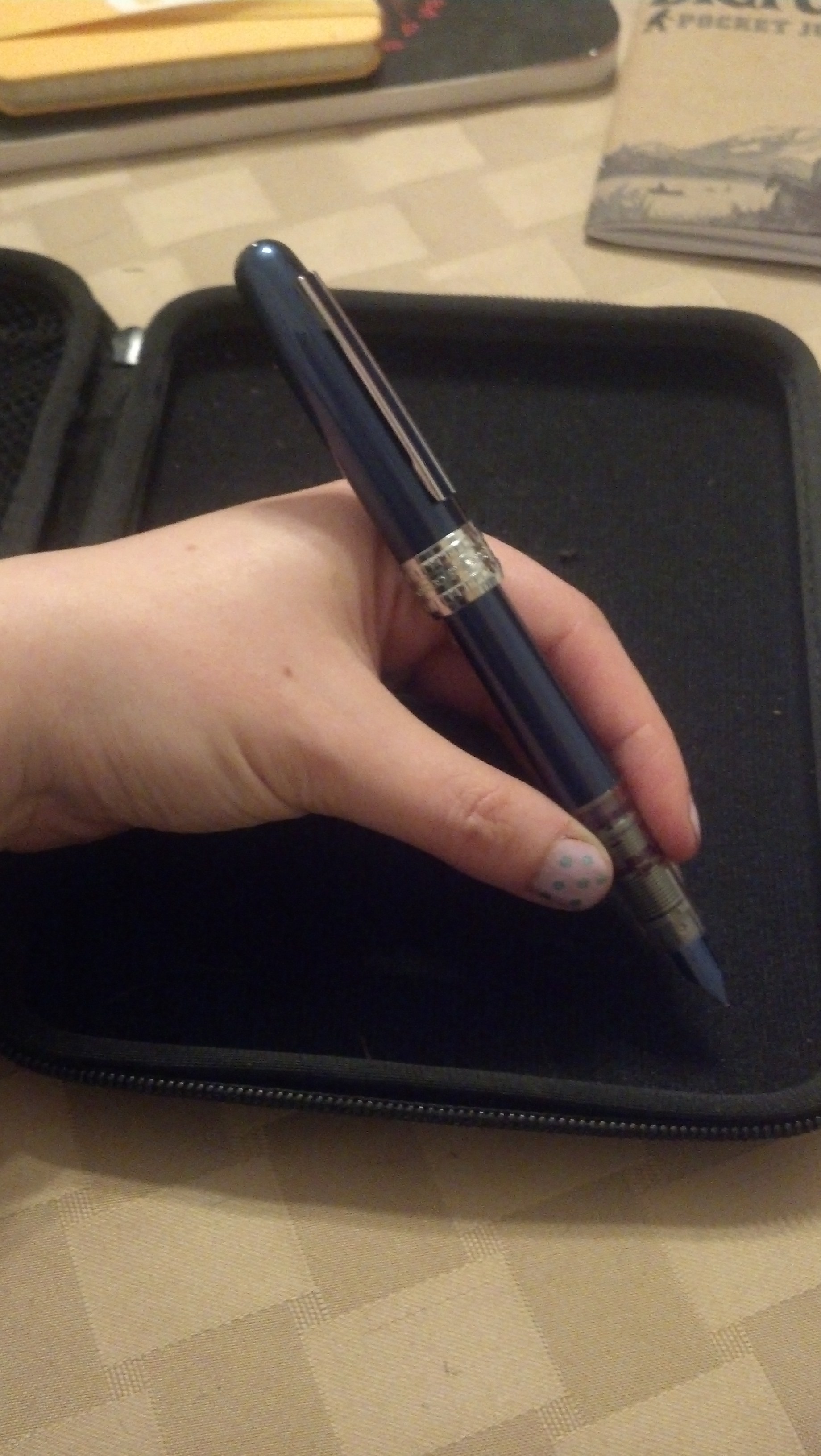
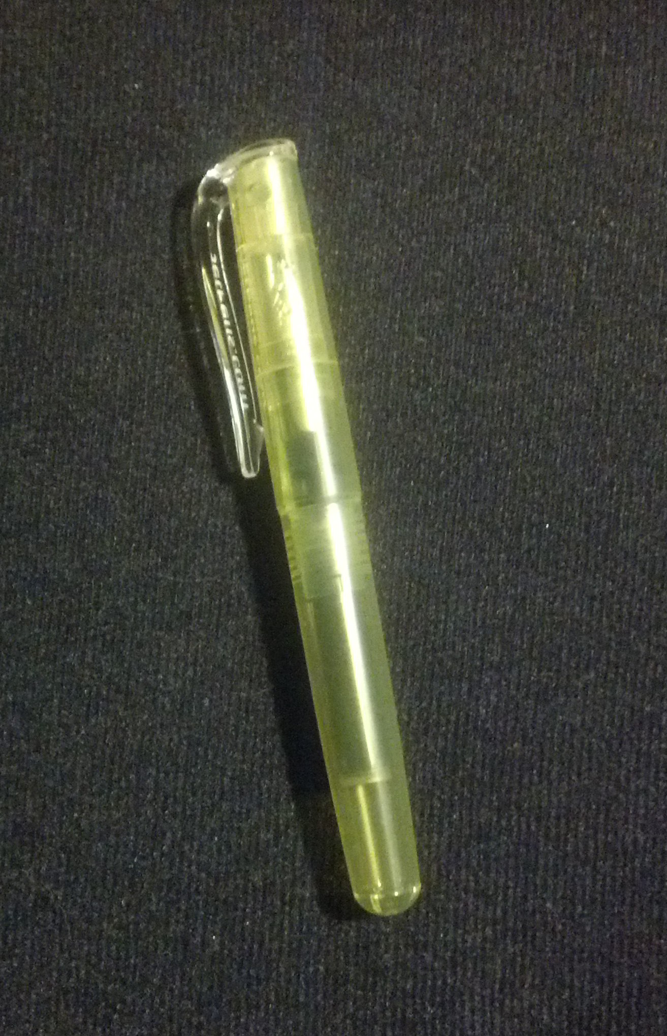
The pen is pretty light and the ergonomic grip is actually really comfortable. If it wasn’t covered in gaudy hearts I’d probably want to use this a lot more. I’m pretty sure my 14 year old self would be mildly ashamed to be seen using this pen.

IMG_20150213_182516_098

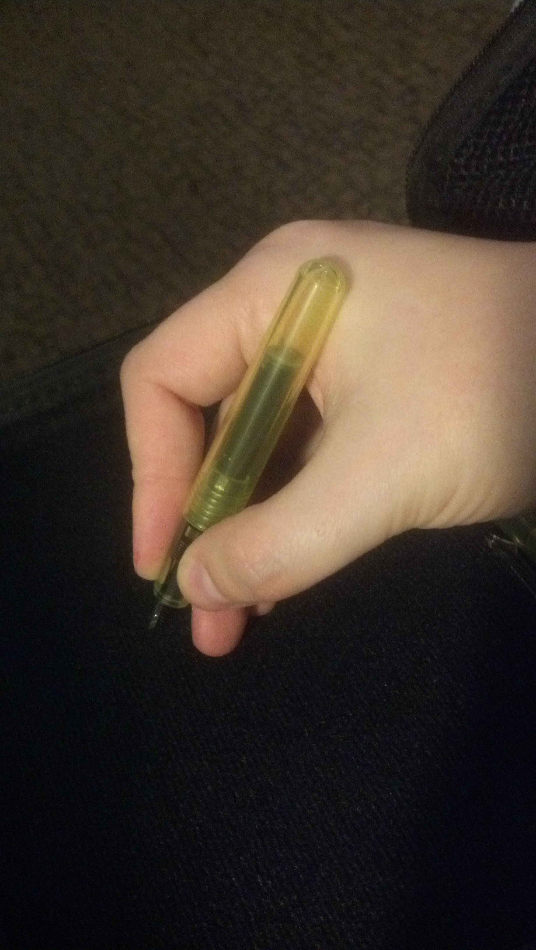
I like the grip on this pen. It’s comfortable. Maybe if I take nail polish remover to it I can make it presentable looking…

IMG_20150213_183134_925

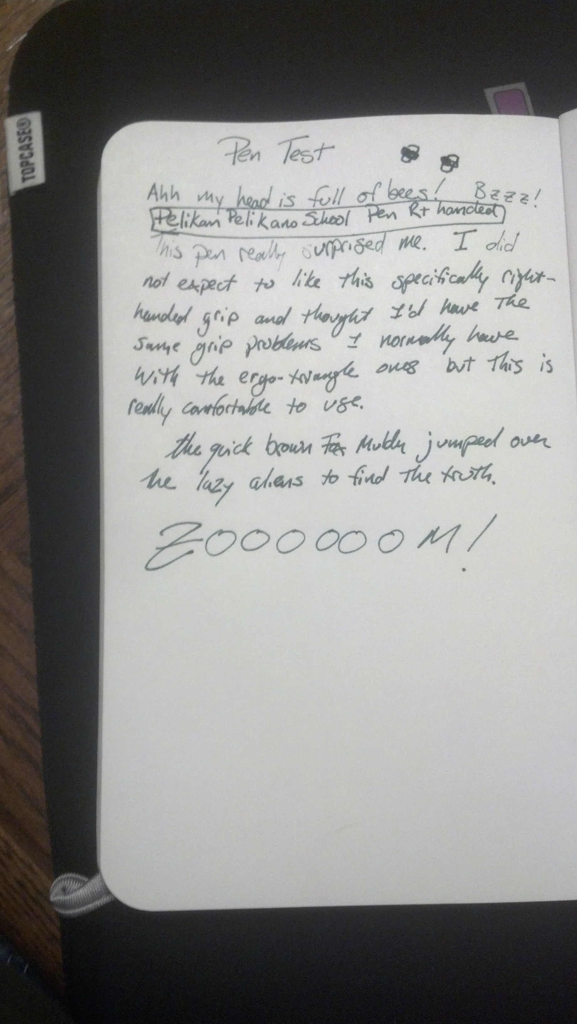
So here’s the test. I couldn’t find my regular notebook so I wrote on the back of a postcard which I’ll probably send randomly to someone I know. The ink behaves fine, but it is lighter maybe more translucent than standard ink to my untrained eye.

IMG_20150213_183157_078

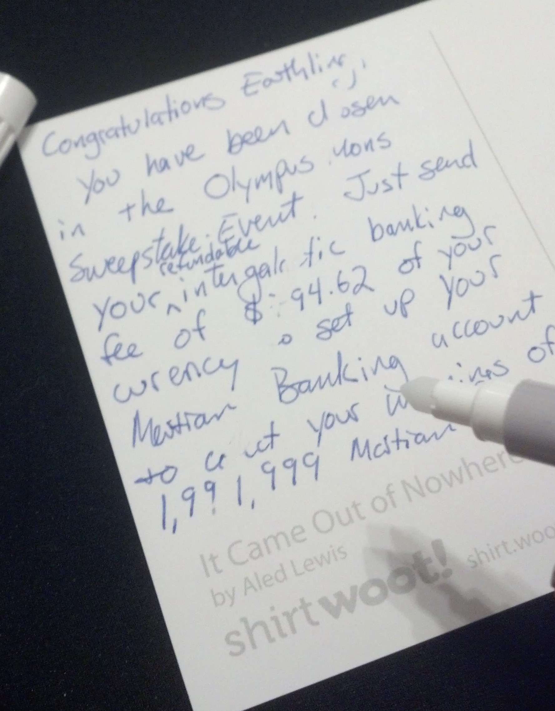
So I just took the eraser pen and went diagonally through the text from top right to bottom left… and holy goats, it works! FUNKY.

IMG_20150213_183224_640

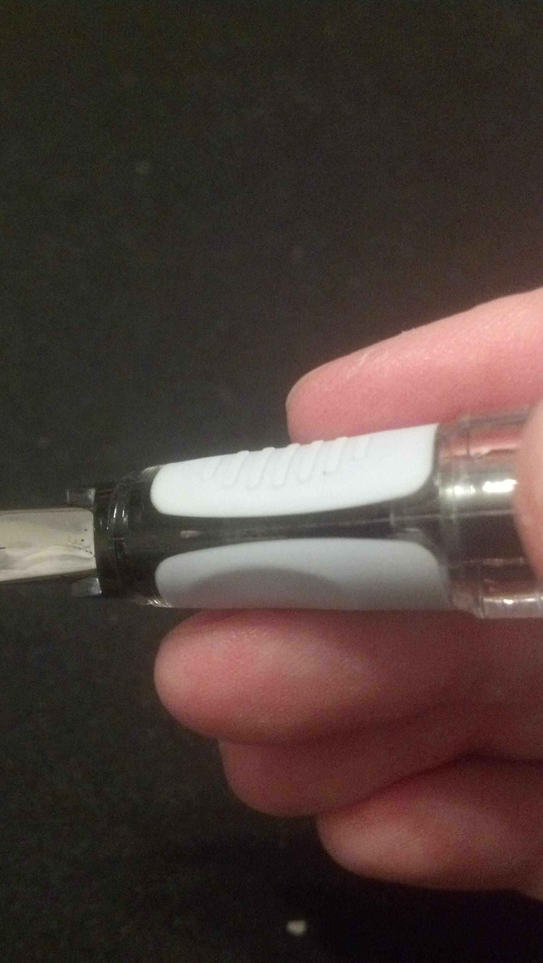
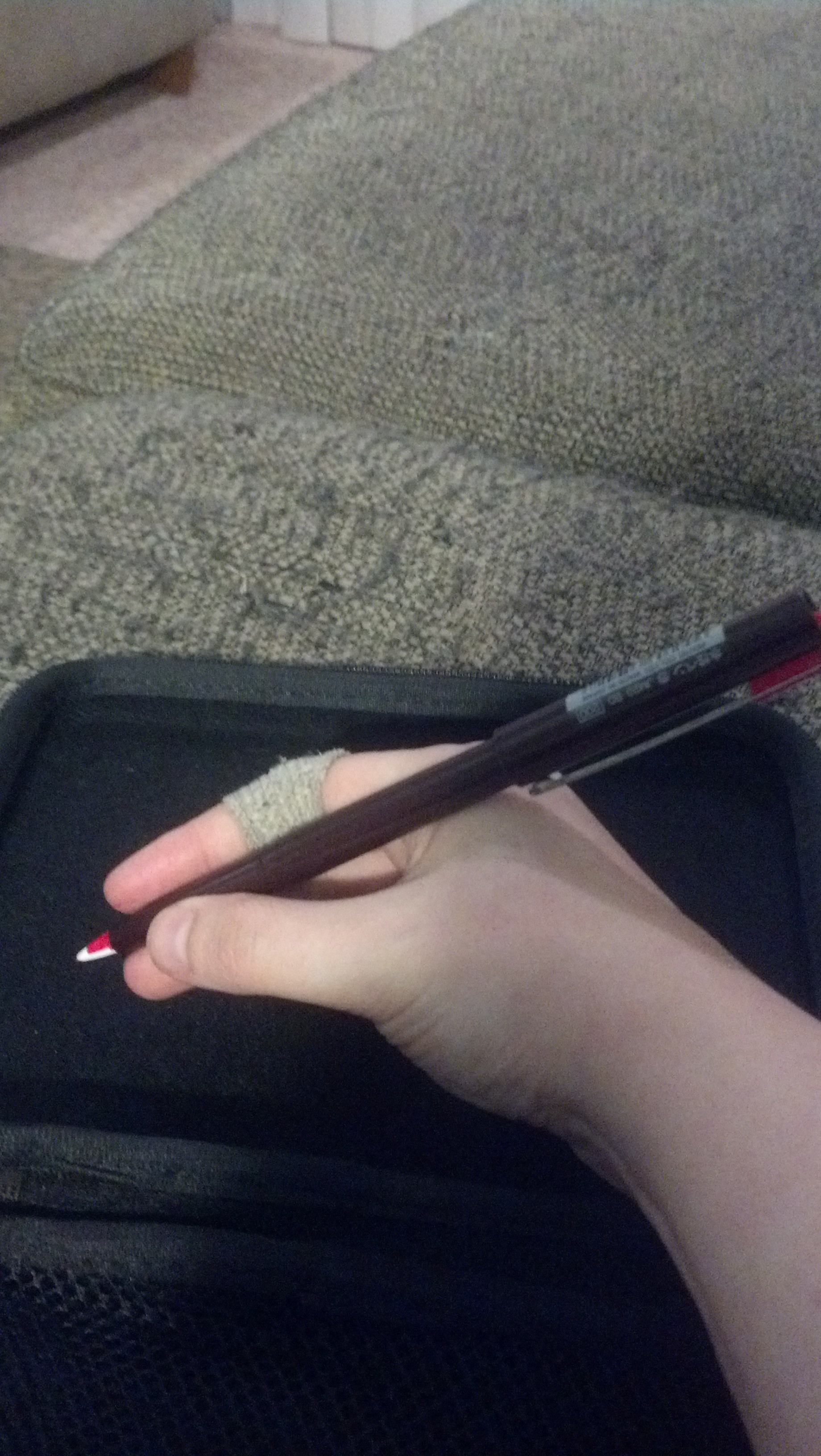
So the thing about the eraser is it makes it impossible for the fountain pen to rewrite what was there… so the opposite end of the eraser is a pen which will write over the erased area. As you can see, the inks do not really match.


The Good

  • Light
  • really comfortable grip
  • should in theory use standard cartridges and converter
  • writes nice

The Bad

  • Lisa Frank Eat Your Heart Out Looks.
  • Eraser only works with included cartridges
  • included cartridges write lighter/more transparently
  • correction pen ink doesn’t match fountain pen ink
  • weird angled ends on outside of pen

Overall grade: B-

The purple sparkly hearts of doom are just very very much not my thing. The correctable ink is kind of neat but I’m not sure how much I need that feature for my uses.

Platinum Plaisir

IMG_20150206_231912_398

This is my penultimate fountain pen review for the foreseeable future. I’ll still review any new pens I get in the future, but I’m not looking to buy any for a bit as I have more editing than composing this year.

The Platinum Plaisir (JetPens, Goulet, Amazon) is bascially a fancier, nicer-looking version of the Platinum Preppy.

IMG_20150206_231931_051


It’s a nice shiny aluminum pen body.

IMG_20150206_232128_346


It uses the same cartridges as the Preppy, which I happen to have some of but are very much not standard.


IMG_20150206_232105_343

IMG_20150206_232014_869


It’s a good pen.

IMG_20150206_231956_348


Of a reasonable size and weight.

IMG_20150207_213236_878

It writes super nice… but I’m just not sure it’s worth the price difference between it and the Preppy.

The Good

  • Good-looking
  • round grip
  • writes nice.
  • writes FAST

The Bad

  • hard grip
  • proprietary cartridge

Overall grade: A-

I like it. I just don’t think I like it THAT much more than the Preppy. I think if I was going to recommend one I’d pick the less expensive one.


Monteverde Invincia Color Fusion Fountain Pen

IMG_20150123_223016_654

BEHOLD! This is my holiday present from my in-laws and it is awesome.

IMG_20150123_223036_625

It is STEALTH BLACK. In case I need to write some super secret messages in the dark and not be seen? Whatever. IT MATCHES EVERYTHING. Also, it’s all black so it always looks good.

IMG_20150123_223213_623

I was sitting next to the candy bowl so you get a Bazooka Joe comic and a mini box of Nerds for scale.

IMG_20150123_223305_478

LOOK AT IT!!! So sleek. So black. So fountain. Pen. Wow.

IMG_20150123_223246_754

It is a metal body so it’s very sturdy and a too heavy for me to use with the cap attached like this for very long.

IMG_20150123_223229_670

Without the cap on the back, it is very comfortable to use and it looks pretty bad ass.

IMG_20150123_230538_463


The Good

  • BLACK
  • BLACK AS MY SOUL
  • MADE OF METAL
  • NO PARENTS…er wait, no that’s Batman.
  • standard cartridge/converter
  • matches everything
  • Looks like Batman’s fountain pen

The Bad

  • Heavy

Overall grade: A


Pelikan Pelikano School Fountain Pen F (right handed)


IMG_20150110_202827_335


This is the first pen that’s really surprised me. I’ve put off buying this one for a long time because I didn’t have high hopes. The fact that it comes in left and right handed just seemed weird to me.

IMG_20150110_202931_378


It comes with an extra long standard cartridge and has an all plastic body.

IMG_20150110_202901_984


The cap is a little funny. I’m not fond of using it posted, but its odd design does keep it from rolling around and disappearing.

IMG_20150116_223144_196

The cap has the Pelikan Pelican on the end.

IMG_20150116_223123_799

IMG_20150116_223106_616

IMG_20150116_222953_848


So here’s where the handed part figures in. The grip is a softish rubbery thing that’s specially handed so that your pointer finger side has ridges for extra control.

IMG_20150116_223004_352


The ridges DO give a lot more control the point where I don’t grip this pen as hard because I don’t have to. It doesn’t slip because the rubber has good traction and the ridges really help.


IMG_20150116_223052_632


The rubber grip wraps under the pen so where it rests on the inside of your middle finger is a lot more comfortable than on many pens, it doesn’t feel heavy and I don’t find myself indenting my middle finger with the pen while using this one.

IMG_20150116_222934_313


My handwriting is especially bad this week. It isn’t the finest nib but it works great in my writing notebook.

The Good

  • awesome grip
  • light
  • sturdy. This pen is made for students.
  • comes in right and left handed versions
  • standard cartridge/converter
  • can use an extra long cartridge

The Bad

  • not the most attractive pen
  • cap is a weird design

Overall grade: A


Fountain Pen Friday: Ohto Poche


IMG_20141219_135355_465


This week’s pen is the Ohto Poche (Jet Pens, Amazon), another one of my Uwajimaya purchases. It comes in a couple different engraved designs (I debated between this wiggly line zebra and the diamond pattern) all of which are pretty snazzy looking.
IMG_20141219_135512_969

IMG_20141219_135528_815
This weeks random item for scale is a Zesty Sauce cup from BK


IMG_20141219_135910_122


This is one of the few pens I prefer to use with the cap posted on the back, it’s just very short and rubs on my hand weird if I don’t… plus it keeps me from having to figure out where I set down the cap. However, when you close the pen it is very small.

IMG_20141219_135643_567

IMG_20141219_135635_282
it also has this really nice jewel adornment on the cap. Normally I hate this kind of thing, but on this pen it works.


IMG_20141219_135656_360
See! TIny!


IMG_20141219_135603_246

IMG_20141219_135827_104


IMG_20141219_135851_828


It is unfortunately so small that it is cartridge only, but for travel that’s not really a problem. I meant to do a normal writing test, but I took it on vacation with me and wrote it dry before I remembered that I needed to do it, so for this week only you actually get a page of WIP.

IMG_20150108_205853_536

The Good

  • snazzy looking
  • thin
  • very light
  • uses standard cartridges
  • nice travel pen
  • actually comfortable to use posted even for my tiny hands and arthritic fingers

The Bad

  • can’t use a converter
  • not comfortable to use unposted

Overall grade: A

Fountain Pen Friday: Manuscript Trio

On my recent trip to Seattle I stopped at the Art Supplies area of the University of Washington Bookstore, which is one of my favorite places to shop for fountain pens, ink, and notebooks. One of the ones I picked up was the Manuscript Trio Italic Pen.

IMG_20141127_223841_947


I love this horrible black and white floral print. My mother owns luggage with this kind of pattern and my brother has dubbed it “The Ugglage.” It NEVER gets lost. It is impossible to miss.

IMG_20141127_224031_288


If you’re a fan of the Lamy triangle grip, you’re going to love this pen. It has a very nice italic nib that isn’t anything special but it writes a really nice line that’s not too wide for everyday writing but would probably look pretty amazing if you had some sort of calligraphy ability.

IMG_20141127_223957_072

I do not hate this pen. I actually really like it, there’s just something about the width of this pen at its widest that makes my hand fatigue really fast so it’s not going to be something I can use for a long time or frequently.

IMG_20141127_224102_089


The Good

  • Unique pattern in amazing print
  • standard cartridge/converter
  • nice italic nib that’s not too big for everyday use
  • plastic body

The Bad

  • triangle grip
  • very wide pen at its widest

Overall Grade: B but a C for me. I really like how it writes, but it’s just too fatiguing for my tiny hands to use for long periods of time or too frequently.

Fountain Pen Friday: Ohto Tasche

I stopped off at Uwajimaya in Seattle’s International District on my way back to Portland and decided to check out the gift store cause I thought they might have some fountain pens… and holy cow, did they. I got several and I’m sure I’ll be going back again in the future.

IMG_20141120_202151_185


Today’s pen is the Ohto Tasche (Jet Pens, Amazon). It’s somewhat similar to the Ohto Rook in size, but I like this one better. I’m not really a pink kind of girl, but I really adore this pinkish silver color and did in fact choose it out of the available colors.

IMG_20141120_202314_015

When you post the cap on the back it becomes very pencil-like in size though heavier in weight. (iPod Nano for scale)

IMG_20141120_202237_531


On the back of the pen is a little rubber gasket so the cap slides on smoothly and holds firm, not wiggling at all on the back of the pen as you write. I’m wondering if micro movements in the cap while I’m writing is why I prefer to use most pens un-posted. This is probably the first fountain pen I prefer to use with the cap attached on the back. The design is so… smart. It really works.

IMG_20141120_202407_848


The pen alone is REALLY small. It’s small even in MY tiny hand.

IMG_20141120_202344_709


I think it also helps that the cap isn’t drastically wider or heavier than the pen. It feels like a single unit when it’s put together in this configuration.

IMG_20141120_210406_347


I’m quite liking this pen. It’s very sturdy but thin and nicely balanced without being too heavy.

The Good

  • Really nice cap design both closing the pen and posted.
  • Very thin
  • nicely balanced with or without cap
  • very sturdy
  • standard cartridge

The Bad

  • going to be hard to find a converter to fit, this like the Rook is probably a cartridge only and I don’t think it would work for an eyedropper conversion

Overall grade: A

I decided to try this out first out of my new pens and I’m quite liking it. I’ve even managed to drop this pen on my driveway already and it didn’t even get a scratch. This is a really good travel pen and the way the cap is designed plus being cartridge only makes me think this is a pen that is very very unlikely to leak and a good choice for every-day carry.

Fountain Pen Friday: Ohto F-Lapa

I really liked the tiny Ohto Rook so I decided to give the larger Ohto F-Lapa (Jet Pens) a try.

IMG_20141113_223319_923


The pen is designed to look like a fancy pen as seen in every yuppie lawyer movie ever. It does look very nice and is extremely shiny (as you can see in my crappy pictures). However, as soon as you pick up the pen you can tell it is not the expensive sort of pen it resembles. It FEELS like a cheaper pen. Not necessarily in a super bad way, but if you’re trying to look like a big shot, don’t let anyone hold it.

IMG_20141113_223332_330


The pen has a black plastic grip that is eerily comfortable. Seriously, I was not expecting it to feel as nice in my hand as it does. It’s the sort of material that seems to hold a little of your body heat so it feels nicer against the skin than the metal parts of the pen. Now, that might be me since I do have something like arthritis in my fingers, but it’s a nice touch.

IMG_20141113_223448_616


The pen is surprisingly light. Even though it is a little bigger than some of the pens I prefer, it is very comfortable for me to use weight wise, and it isn’t uncomfortably big even with the cap posted on the back.


IMG_20141113_223416_064

The black plastic does not fit flush against the metal part before the nib, which is good because it keeps your finger on the plastic, but there is a bit of an edge there that, while it doesn’t dig into my finger, I think would get annoying if I was writing at length with this pen.

IMG_20141113_224349_999

IMG_20141113_224327_305

The Good

  • Looks expensive
  • light
  • very nice plastic grip
  • standard cartridge

The Bad

  • does not feel expensive
  • may hurt fingertip with extensive use
  • gets fingerprints

Overall grade: B

I kinda like it. I’m looking forward to using it more, so clearly I don’t hate it. I may take this to work to use as it looks impressive even if it doesn’t hold up to hands-on scrutiny.


Pentel Pulaman JM20 Disposable

IMG_20141106_212446_166


So, you can probably guess that I bought a bunch of cheap fountain pens I didn’t already own. I am doing this blog feature just about weekly so if I was buying all the expensive pens I’d probably already be broke and destitute. I bought The Pentel Pulaman strictly off the price and a “huh, that’s weird” glance at the nib.

It is a very unique pen. I’m just not sure it’s really a fountain pen.

the pen "nib"
the pen “nib”

I’m looking forward to running this pen dry because I am dying to take it apart without covering my house in red ink. It has a plastic delta-wing shaped tip that appears to have a core running through it that feeds the ink. Honestly, it reminds me most of a Papermate Flair pen. It writes like a Flair pen, and with certain motions it makes a fine splatter of ink on the page as I loop a letter or shift the tip. I kind of like the effect, but it would annoy the crap out of me if I was trying to write very precisely.

IMG_20141106_212606_211
without cap
IMG_20141106_212624_909
with cap

It’s a very standard pen size. Feels pretty much like using a felt tip pen. I think it would make a killer redlining pen or homework correction pen. Buy it for all the editors and teachers you know.

IMG_20141106_212656_458

The Good

  • Cheap
  • really unique design
  • lovely felt-tip style writing experience

The Bad

  • I just can’t consider it a fountain pen.
  • splatters ink slightly
  • disposable, non-refillable

Overall Grade: Well, as a Fountain Pen I’d say on an A-F scale it’s a Potato. On a scale of A-F for felt pens, it’s an A. It’s just not what I think of for fountain pens, even disposable ones.

Fountain Pen Friday: JetPens Chibi Mini Pen

IMG_20141030_230312_553

When I found out JetPens was now offering their own low-price mini fountain pen I knew I had to try it.

IMG_20141030_230323_834

I was so excited to try this pen because it seemed to be designed with someone like me in mind.

L to R: Otho, Petit1, Kawacco Sport, JetPens Chibi, standard ballpoint
smallest to biggest closed: Ohto, Petit1, Kawaco Sport, JetPens Chibi, standard ballpoint

Here’s a comparison of how big it is in comparison to a standard ballpoint and a bunch of other mini fountain pens.

Largest pen body top to smallest at the bottom

As you can see, it isn’t quite as small as the Petit1 without the cap posted, but it is smaller than the Kaweco. It’s about the same weight as the Petit1, maybe a bit lighter if they both had full cartridges in them (my Petit1 does not have a full cartridge right now).  I’m guessing that it will probably do a fine eyedropper conversion but I haven’t tested it.

Pen with cap posted compared to ballpoint

With the cap posted on the back it’s pretty much the same size as a standard pen.

Cap posted, pen in hand

This pen feels really nice in my hand. It’s nicely balanced with or without the cap and comfortable to write with.

IMG_20141030_223250_318

I want to love this pen. I want to love it with with the fierce passion of a bag full of badgers. The design is wonderful. I’m not a fan of the color (it only comes in transparent neon yellow) but I could overlook that. The problem is the nib.

IMG_20141030_230349_334


It’s just scratchy and on all the papers I tried it on it was scraping up bits of paper fiber which eventually collected on the nib soaked in ink. It’s not… unusable, but it’s an unpleasant writing experience. I’m hopeful that fiddling with the nib and some sandpaper or maybe even canibalizing a different nib from a different pen and gooping it into place might be possible, because I really like how the pen fits in my hand… I just don’t enjoy using it as it came.

IMG_20141030_224247_593


The Good

  • Cheap
  • nice smooth grip
  • standard cartridges
  • wonderful pen design, feels nice in the hand
  • light-weight
  • I think this pen will work for small and large handed people

The Bad

  • only comes in one color and it’s neon yellow
  • The nib as it arrived is a scratchy writing experience

Overall Grade: C+

The nib problem is a pretty big problem but I’m hopeful I can find some way to doctor it to write smoother cause I really like this pen design.